Top 5 Best and Worst NBA Cup Courts of 2026
NBA Cup Courts in 2026: Best and Worst Designs
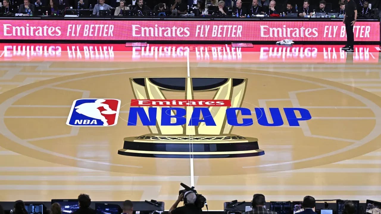
The NBA season has kicked off, but the spotlight is already on the NBA Cup starting October 30. Group play runs through November, with the knockout stages set for early December. Last year, the Knicks claimed both the NBA Cup and the NBA championship, sparking talk that this year's Cup winner might foreshadow the eventual league champion.
For 2026, every NBA arena adds a splash of color for the Cup, though the designs are more uniform compared to past years. Here’s a look at the five best and five worst NBA Cup courts across the league.
Best NBA Cup Courts of 2026
- Cavaliers: Cleveland's court features a striking gold baseline and sidelines paired with a deep red playing surface. The gold trophy graphics stand out beautifully against this wine-and-gold palette, creating an eye-catching setup that complements their playoff colors from last season.
- Nuggets: Denver embraces a bold dark red court combined with blue logos at center court and yellow edging. This tri-color theme highlights their identity uniquely, even if some aren’t fans of the red shade.
- Timberwolves: Minnesota integrates gray, a core part of their updated colors, without making it dull. The gray court is bright enough, and the vivid blue trim along with the new logo at midcourt makes for a pleasing look.
- Mavericks: Dallas opts for a vibrant blue-and-black scheme instead of a plain gray. This choice helps the gold trophy images in the paint and center court pop sharply under the bright lights.
- Jazz: Utah stands out as the only team with a purple court, complemented by sky blue borders. This combination fits well with their jerseys and gives the court a unique flair without extra effort.
Worst NBA Cup Courts of 2026
- Warriors: Golden State's dominant gray court feels off-brand since gray isn’t part of their usual colors. Their normally striking court design is muted here by this uninspired choice.
- Lakers: The Lakers’ court is mostly yellow with black sidelines, featuring only a tiny purple logo at center court. The yellow is close to a highlighter tone rather than the warmer shade tied to Kobe Bryant's era, missing an opportunity to include more purple accents.
- Grizzlies: Memphis uses a dark gray playing surface that clashes with their typically blue-heavy color scheme. Brighter blues or their classic throwback colors would have enhanced their court’s appeal.
- 76ers: Philadelphia’s court sticks to a blue-on-blue look, using navy borders around a royal blue floor. The minimalistic '76' at center court and lack of patriotic flair makes the court less lively than it could be.
- Spurs: San Antonio chose a nearly all-black design, with a very dark gray court barely contrasting the black sidelines. Considering their colorful Fiesta palette options, this was a missed chance to brighten up the arena.